Milepost Zero
Rebrand
McGregor Square’s food hall needed a refresh of the brand to communicate a sense of location, dining variety and the dynamic nature of McGregor Square.
Brand Assets
Primary Logo
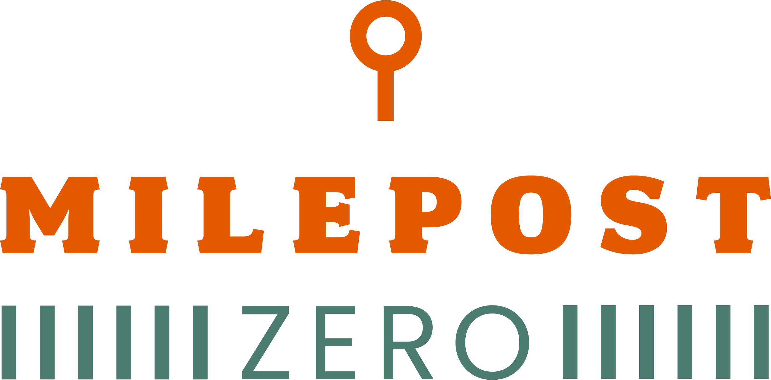
Milepost Zero’s logo pulls design cues from its name inspiration: the railroad.
Using a traditional, serif typeface combined with a modern sans-serif typeface, the logo reflects both a sense of old-school Denver with a playful modern feel.
The “post” icon represents a literal milepost marker that one would find along a road or railway, as well as a pin that one would use to digitally share a location
“drop a pin!”
This serves as a beacon for LoDo to gather, whether it’s the start of the party or the end of the night.
The “rails” represent a more literal railroad, while highlighting that Milepost Zero is at the center of it all.
Secondary Logo
The acronym logo makes use of Milepost Zero’s initials, to create a unique element for quick or minimal branding.
Milepost Pinwheel
The post icon is used to create a branding element to draw the eye and highlight specific information.
Use as a design accent on menus and signage.
Slogan Wheel / Social Icon
Use as a supporting design element or as a standalone graphic.
Weave
The post icon is used to create a branding element to draw the eye and highlight specific information.
Use as a design accent on menus and signage.
